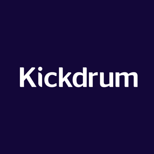
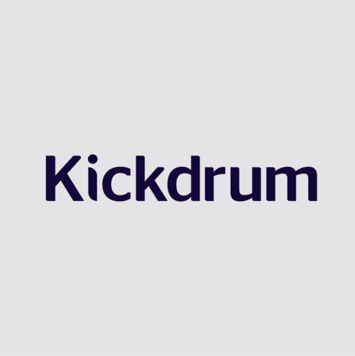
Logo
Our logotype is timeless and universal, leaning towards a more “humanistic” execution, rather than the rigidity of a “programmed” feel, in its visual representation. It's a medium weight with subtle tweaks to the letters to create angles and character.
Dark
Light / White
Social Media Lockups
We should use the full Kickdrum name whenever possible, but in situations where the graphic is so small that the name cannot be read, use the K with a red period as a small but confident statement.
Preferred Color Option

Subtle/Neutral Color Option

Colors
PRIMARY PALETTE
Our colors are intended to be modern, bold, contemporary and daring. The "royal navy" is regal and confident while the red and gray accents are a call back to our original colors.


SERVICE PALETTE
Use these for coloring supporting items, lists of services or other supplementary graphics.